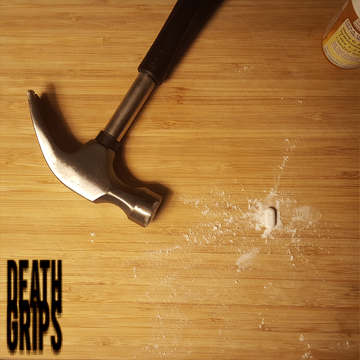
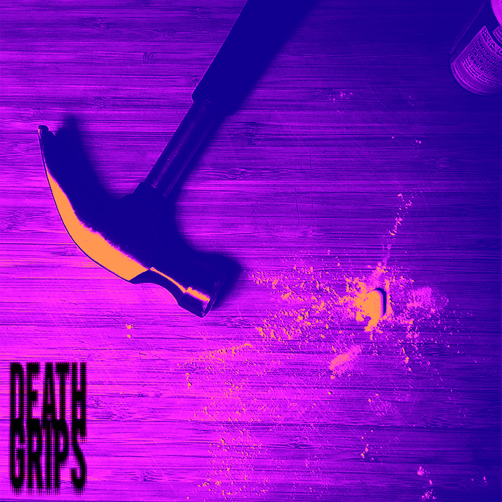
This school project at UCLA tasked us with creating a new album cover for a band of our choosing. I chose Death Grips, a Sacramento based experimental industrial hip hop group. They are known for being intentionally vague and obfuscating details regarding the group and its members as well as their process and release schedules; they almost entirely refuse interviews. They intentionally seek lower fidelity visual quality in their work making much of it feel like found footage or amateur despite high-quality sonic production. Much of their music deals with themes of anger, discontent, destructive drug abuse, authority, ego, psychosis, and wanton violence.
LOGO
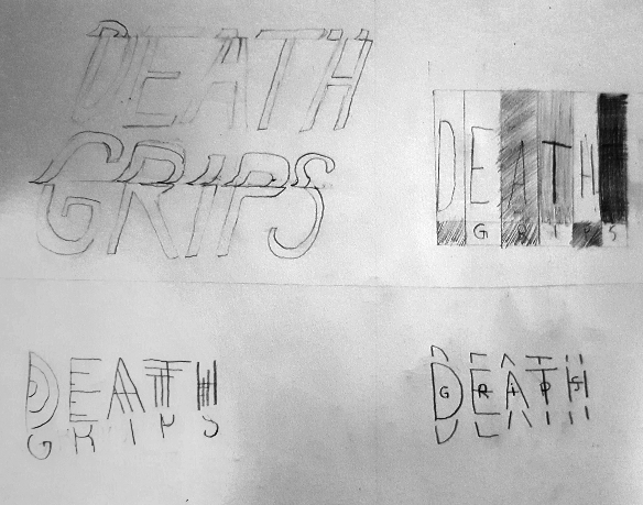
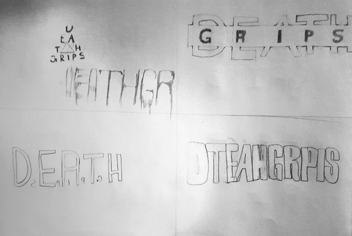
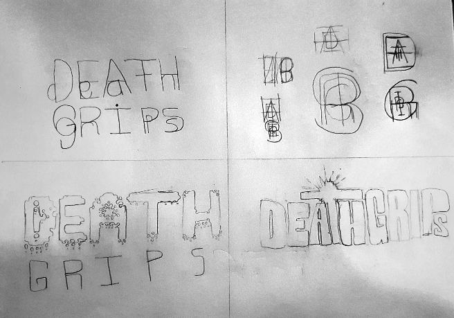
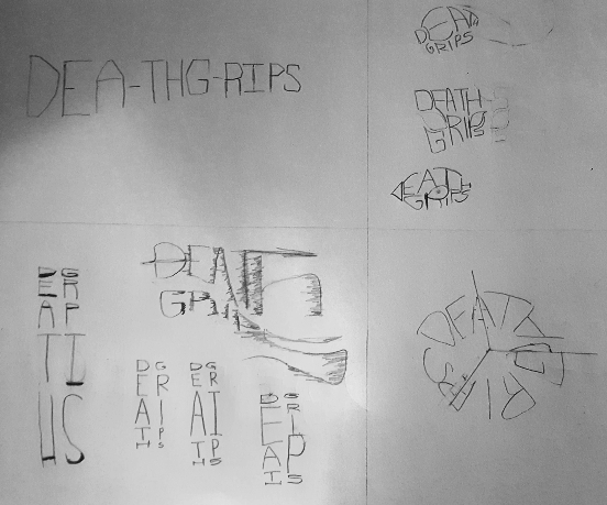
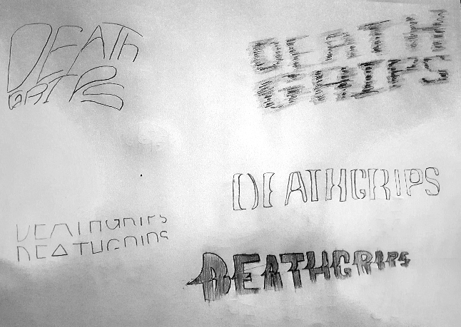
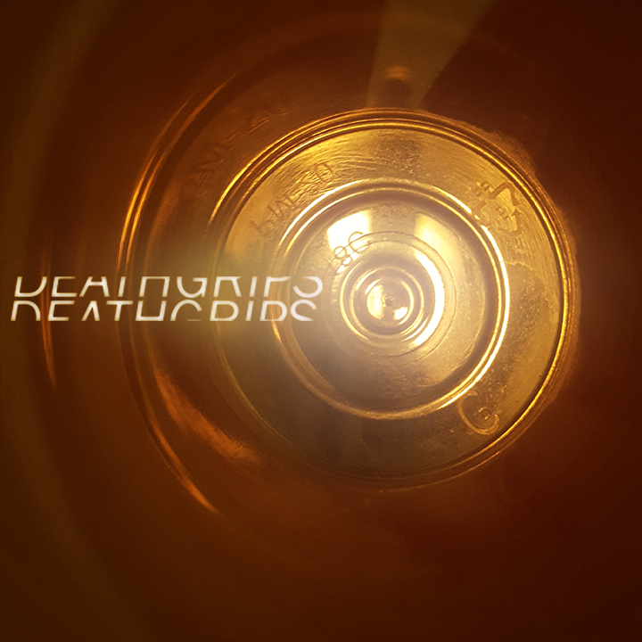
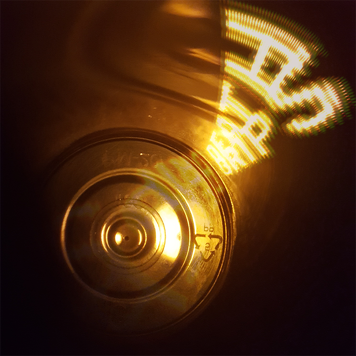
First I needed to construct a logo that fit the group's style. The group doesn't have a consistent logo but each album design feels on-brand. I wanted to play with different styles of distortion or printing error, even going as far as spelling the name wrong. However, I wanted to avoid the glitch aesthetic entirely as it gives a feeling of high tech not suitable for the Death Grips style.
FIRST ALBUM CONCEPT
The first idea I had came from a photo I found of three dogs wearing gas masks during World War I. I liked the imagery of these dogs, shaggy and unwashed looking, being used as a tool of war when they’re often seen through a lense of comraderie with humans. I wanted to warp and distort it to be remiscent of the band’s premier EP Full Moon which featured a near unintelligible grainy image.
SECOND ALBUM Concept
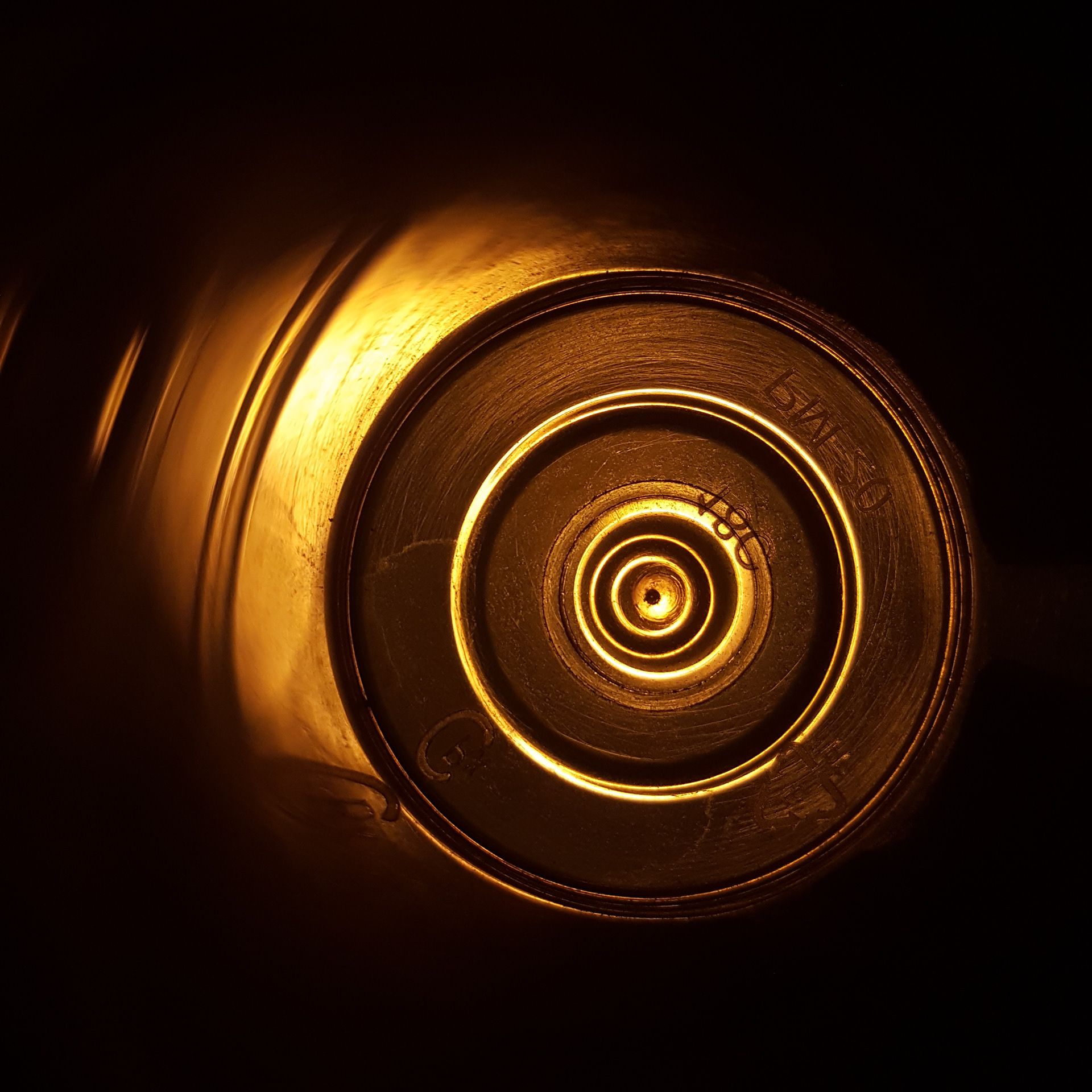
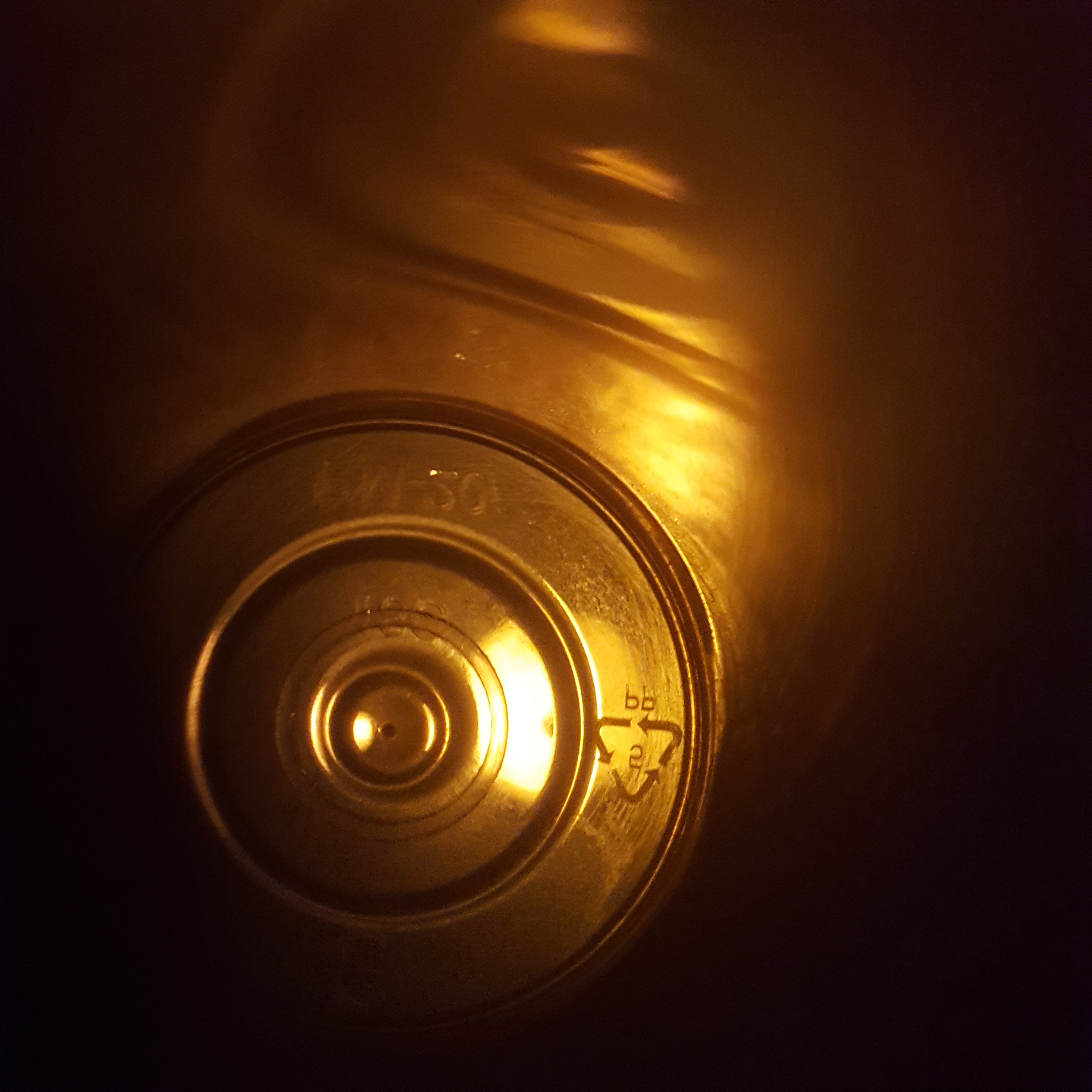
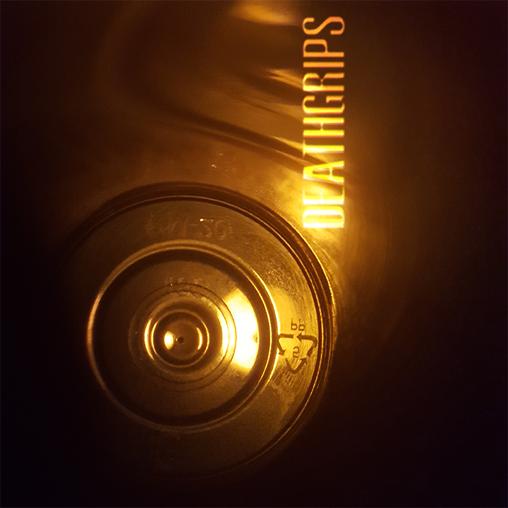
The second idea was a photo I shot looking through the inside of an empty prescription bottle. Death Grips heavily features prescription drug abuse in a regressive and destructive light through their music. The design communicates a point-of-view of an addict looking desparately at the bottom of an empty bottle of pills. The abstract nature of it helps it feel lost and warped. I settled on using some of the more metallic looking photos as they gave the appearance of the brass and primer of a bullet.


THIRD ALBUM concept
A more on-the-nose take on drug abuse with the group. The scene depicts a hammer for, quite literally, “crushing pills”. Using a left over hydrocodone prescription bottle from a recent surgery and some flour I wanted to make an exaggerated addiction scene. A lot of the album and promotional art is made by members of the group themselves rather than hiring a professional. I felt an album cover utilizing minimal touching up would best sell their homemade amateur look.
