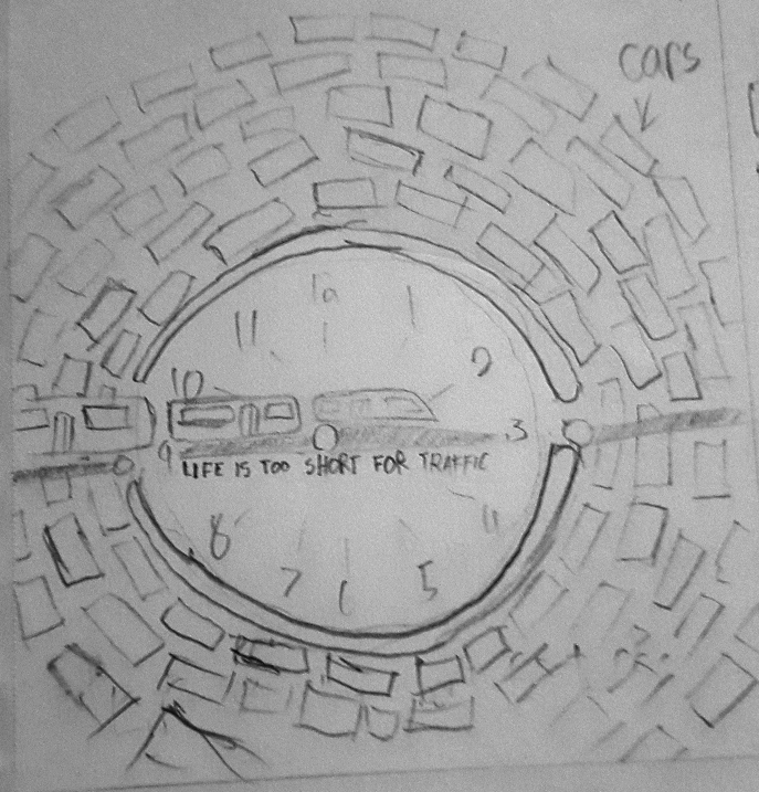
A project that explores metaphor in advertising. The design suggests a train making stops as it moves horizontally across the clock, effectively cutting through the line and monotony of driving. I tried to depict the clock hands as part of the rail line. All the while a horde of cars circle endlessly around the clock.
CONCEPT
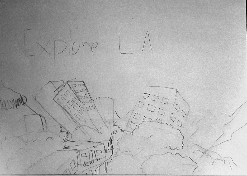
I started with a few different correlated ideas for metro transit and sketched up ideas that fit. I played with convenience, eco-friendliness, and exploring Los Angeles. The LA Metro has a consistent graphic style for its illustrations that I wanted to maintain. It uses a lot of simple shapes and soft, usually secondary, colors in its palettes. Strokes are usually excluded entirely.
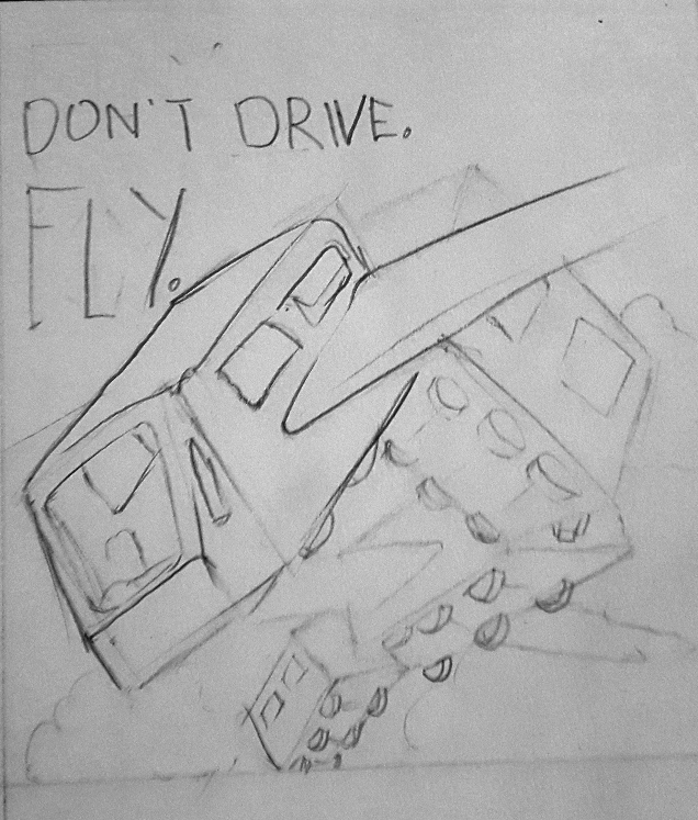
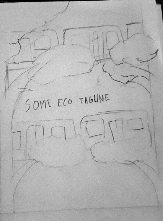
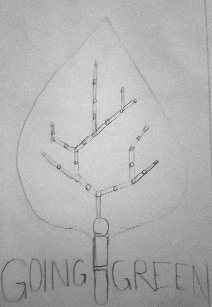
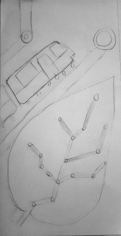
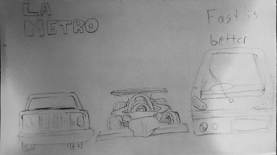
I played with a few different concepts to get the initial ideas across. Time metaphors, soaring trains, a train map as the veins on a leaf, comparing the Metro to a race car, etc.
FINAL
I ended up going with the first concept of the train crossing the clock. I felt this was one of the most interesting to play with and got its idea across visually. It lent itself well to the already established Metro style mentioned in the initial goal.
