A branding project for a fictional band invented by the student. I created an industrial electronic trio named "Reign on my Pareid". The name is a play on the word Pareidolia, meaning the recognition of the human figure on a conceptual or abstract level. The name suggests an oppressive force, reigning over even the basic representations of humanity.
I opted for the acronym "ROMP" to evoke the sort of memorability bands use for longer names like ELO for Electric Light Orchestra or CCR for Credence Clearwater Revival. By layering meaning behind each of the names and acronyms, I think it keeps it in-tune with a more counter-culture band, rewarding those who know more about the band's history and style. ROMP is also sort of ironic as a fun word representing a band that is heavy in its style and sound.
LOGO EXPLORATIONS
First, I wanted to explore different, eclectic styles to see if anything eye-catching popped out; elements in lock-up or layout that felt unique or memorable. I mostly stayed away from typefaces and used the pen tool near exclusively to keep from growing attached to any shapes endemic to a type and really make it feel tailor-made.
NARROWING
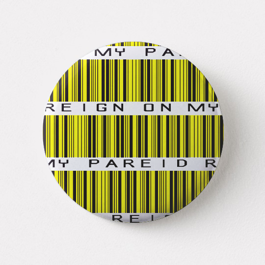
I opted for a heavy, industrial look that also evoked the image of a barcode. Different weights, kerning, and subheadings were experimented with.
REFINING
I wanted to really drive home the cold, hard feel to the group while also hoping to tie into the music a bit more. I went with a really angular style of mark reminiscent of logos used by metal bands while still keeping the hallmarks of the previous designs.
FINAL
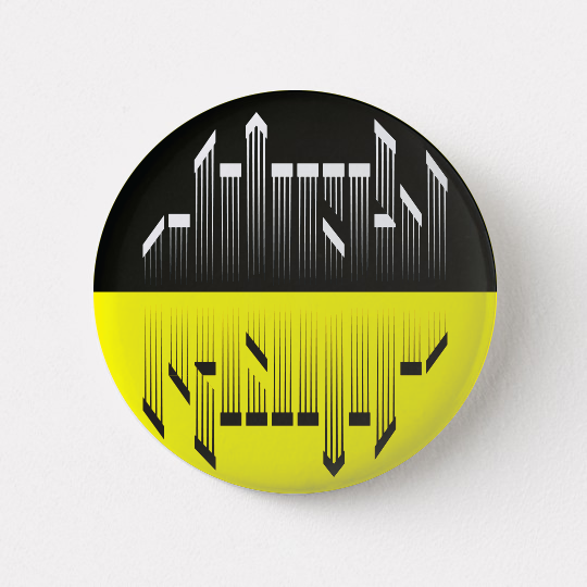
The final selected logo I felt was the one with the least frills. I liked the hard chopped top with the angles pulling the eye downward. I felt as though downward motions were the most oppressive in feel and had a heavy weight.
MERCHANDISE
LEFT: An illustration for a poster depicting the trio together in an ominous composition.
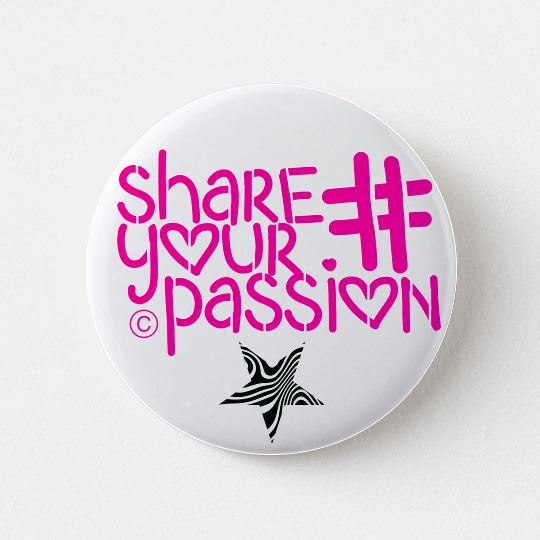
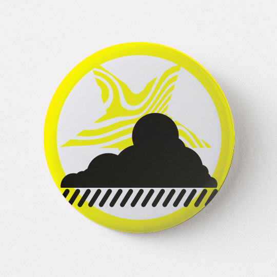
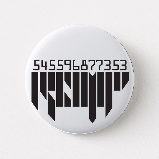
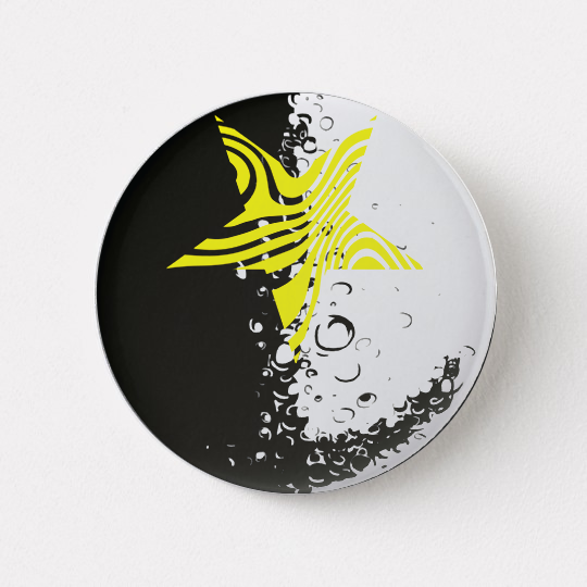
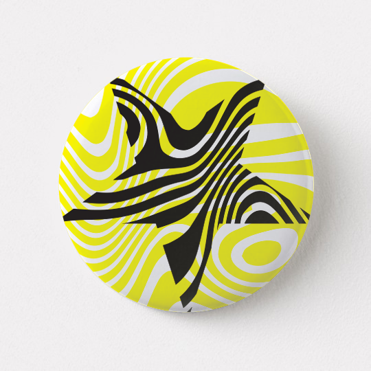
TOP RIGHT: For merchandise, I made a mock-up of collectible badges in line with the trio's brand styling that would only be available at concerts, adding to exclusivity.

SHARE YOUR PASSION
“Share Your Passion” is the name of an album and also a semi-facetious viral campaign encouraging the fans to “share their passions”. The logotype is a happy, bubbly font called Love with hearts built right into the typeface. I added stencil pylons to make it feel manufactured and reproduced, taking some humanity out of it. The Copyright mark further establishes it as a marketing ploy instead of an earnest statement. Below the title, a block of text about legal use of the slogan threatens litigation for infringing on the logo thus cementing that Share Your Passion really is just a means for viral marketing and belongs to the company that made it. As a final little insult, it ends with “follow your dreams” as if to be encouraging after all that followed by the star logo as a sort of signature.
The illustration depicts a girl, similar to the one in the previous poster, attempting to share her music, her passion, with a freshly dead body. It is meant to commentate on the over-importance we place on ourselves and the inappropriate times we decide to share parts of our lives such as recording and posting tragic events on social media. Over her is a canopy and rain for Reign on my Pareid. However, instead of shielding from the gloom, it’s actually encouraging it as it’s not raining anywhere else around her, just where she’s sitting. She brings the misery.
COLORS
